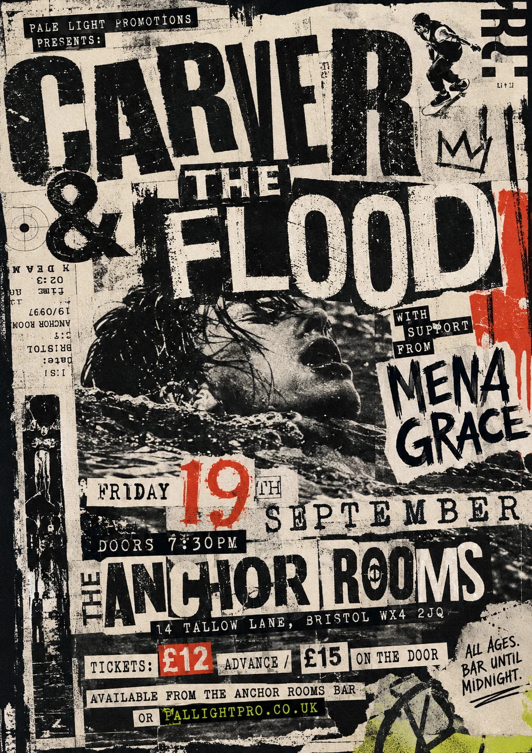
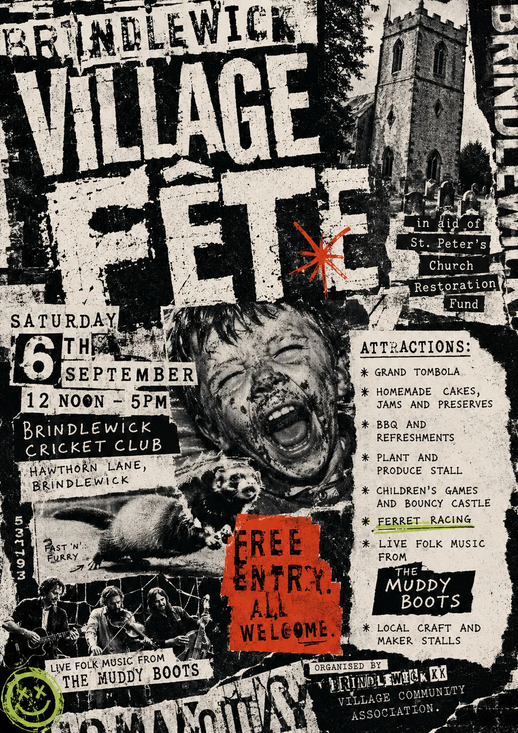
Grunge Typography (1990–1998)
David Carson at Beach Culture and Ray Gun magazine made illegibility a legitimate aesthetic position. Type is set in damaged, wrong, or distorted fonts; images are blurred, scratched, or printed over with text; the conventional hierarchy of headline and body is abandoned in favour of emotional rawness. Anti-design, but only possible because its practitioners knew exactly what they were destroying.
Legibility suffers by design — keep event essentials findable despite the chaos
Fête poster
Gig poster